Pad & Quill Review — Write on your touchscreen, in retro style
App Type: Uncategorized
Our rating: 


By: Daniel Nicolae
Version #: 1.0
Date Released: 2011-12-14
Developer: Fabulously Retro
Price: 0.99
User Rating:From Fabulously Retro, the makers of the fabulously retro notebook app Meernotes, comes another notebook app that’s a little less retro and perhaps a bit more fabulous than Meernotes. This new app is invitingly called Pad & Quill, named after the Minneapolis-based company that sells bookbindery cases for iPhones, iPads, and other similar gadgets.
Unlike Meernotes, which is designed only for the iPhone and iPod touch, Pad & Quill is a universal iOS app. Hence, its usability also applies to the iPad, in addition to the two smaller iOS devices. And what a joy it is to use, be it blown up on the screen of an iPad or optimized on that of an iPhone or iPod touch. But since it is chiefly a writing app, prolonged use is recommended to be done on the two-handed keyboard-friendly screen of the iPad.
Pad & Quill not only bears the name of the gadget case company but also borrows the company’s core design principles. The company is known for the fine craftsmanship exhibited in its products, framed as they are with birchwood as well as bound in leather. Naturally, the notebooks in the app look as though they were fashioned in the same way.
When creating a new notebook, you’ll be asked to choose from ten different designs, each with its unique combination of colors and patterns for its label and cover. Once you’ve decided on a design, you may now enter a title for your chosen notebook and add it to your shelf. The shelf is where all your notebooks are stacked, with their titles listed right beside them. Tapping on a notebook opens it to its first page, but tapping on its bookmark opens it to its table of contents, which, by the way, is conveniently auto-generated as you write. The length of a page is limited only by the length of your note, i.e., it’s unlimited. Simply turn to a new page if you desire a separate note.
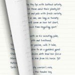
A number of font styles, including marker felt and bold sans serif, are available, with non-cursive handwriting set as the default style. Also customizable are the font size, font color, and paper style. These options, along with an email button and toggle switches for the appearance of rule lines and the application of changes to the entire notebook, can be accessed by tapping the bottom of the screen to bring out the hidden options menu.
Writing on Pad & Quill works both ways (in landcape or portrait mode), and so does reading notes. However, it should be noted that landscape orientation is supported by these two actions alone. So, if you’re reading or writing a note in landscape mode and you tap the icon that should take you back to the shelf view, you’ll first be prompted by a pop-up message to rotate your device back to portrait orientation before you can return to your shelf. This is rather annoying. Surely, making the currently portrait-only notebook shelf look good in landscape, thereby getting rid of the obstructive pop-up message, isn’t going to be particularly demanding for the developer of such an elegant productivity app. And while the developer is at it, squashing bugs (incomplete scrolling in landscape mode, accidentally turning the page when moving the cursor from character to character, among other nitpicks) and adding more important features (password protection, Dropbox sync as an alternative to iCloud, etc.) should be in the developer’s to-do list, which is of course recorded using Pad & Quill.
Quick Take
Value:High
Would I Buy Again:Yes
Learning Curve:Low
Who Is It For:Anyone who appreciates a well-made productivity app
What I Like:Beautiful design, multiple notebooks, unlimited pages, variety of font styles, automatic iCloud sync
What I Don't Like:Minor bugs and annoyances, no password protection, no Dropbox support
Final Statement:Pad and Quill revives the lost art of writing with an old-fashioned pad and quill—and does so in a beautiful, if slightly buggy, manner.
"Beautifully retro" (WIRED)
"I cannot get enough of the interface: It’s easy to use and absolutely stunning." (APPADVICE)
"This app is so beautiful when it's open I kiss my screen." (USER)
Pad & Quill organises your notes in classic notebooks kept on a wooden shelf. It's intuitive, simple and beautiful. Inspired by the Italian bonded leather cases made by Pad & Quill, the app turns your device into books you will truly love.
? CORE FEATURES ?
- organise notes into different books
- sync notes on all your iDevices
- realistic page turn effects
- universal app
- beautifully designed
? CUSTOMISE ?
- 10 fabulously designed book covers to choose from
- 10 beautiful fonts (font size adjustable)
- different ink colours
- different paper styles (plain, ruled, wrinkled, bookish, squared...)
- customisable note titles
- bookmark individual notes
? MORE FEATURES ?
- automatic page of contents
- e-mail notes
- typing is supported in both landscape and portrait mode
- infinite digital paper & unlimited number of books
The app is universal and will run on iOS 5 and higher. The syncing feature requires you to have an iCloud account.
? KNOWN BUGS (to be fixed in next release) ?
- Help descriptions will not disappear if you use an external keyboard (to fix, simply disable keyboard, start writing, and then connect keyboard again)
- Landscape is sometimes not working on iPad (iOS 5.01 and higher)
- Crashes related to loading documents


 notebooks


