All About The New iOS 7 – Apple Innovation
After maintaining the same GUI since 2007, iOS is was at the moment when we needed a big change. It happened and it comes in the form of iOS 7 with a new design and improved functionality. The operating system is not revolutionary but is rather inspired by the vision of webOS and Windows Phone critics.
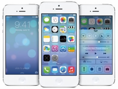
Apple quit the old design of the operating system in favor of a more “flat” one were the icons do not have the same visual elements that indicate its depth. Already available in beta for application developers, iOS 7 arrives in the final version in the autumn, probably with a new iPhone.
With simplified icons that seem inspired by Windows Phone and multitasking system almost identical to the webOS, iOS 7 offers a new look and new complex functionality. At first glance, the most important news is the icons, accompanied by special wallpapers that changes appearance when the smartphone is tilted. The “Slide to Unlock” now includes a new gesture: the user can get notifications on the gadgets screens and with a bottom-up gesture. iOS includes the much awaited another function: the automatic update of applications.
The notification system includes some improvements but the most praised one brought by iOS 7 is a Control Center, which provides quick access to settings that were “buried” in the menu, including Wi-Fi connectivity, brightness and access to Airplane Mode. Both new systems of control can be accessed in Lock Screen. To keep pace with the competition, Apple included in iOS a multitasking system in which the user can navigate easily between different active screens, similar to the Windows Phone system. There are several significant changes in Safari, the unification of the two bars (Searching and URL) and more flexibility in terms of tabs.
From first impressions, GUI style is more diverse than that iOS users were used so far, but Apple still has time to improve some little details until the official launch of the operating system.


 Apple Innovation