Insight Into Your Userbase: How People Really Use the iPhone
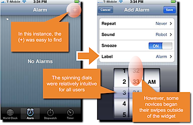
Create with Context – a strategic research and design firm based in Silicon Valley – has conducted some research into how people use their iPhones and the apps on them. The result is How people really use the iPhone – a compelling 61 slide presentation.
Create with Context’s findings come from a combination of in-lab and “expert heuristic evaluation” or, in laymans’ terms, users interviews and in-house user participation. Some interesting points they note:
- “As iPhone developers, it’s tempting to believe that everyone knows how to use all of the iPhone applications and interactions. In our research, however, we found that take-up of interactions [..] was often quite slow.”
- “None of the novice users understood the user of the (X) button” (in location fields)
- The “swipe to scroll” mechanism was easily understood generally.
- Some users assumed the + (to add bookmarks in Safari) was to increase font-size / zoom.
- Direct 1 to 1 manipulation of an object on the screen is a winning strategy
- Ambiguous UI elements tend to confuse the most
- On the App Store, “all participants quickly gravitated to Search.” This makes your apps’ names and descriptions important.
- User comments include a like for “vibrant colors” in the app icons and “If it was a poorly designed icon, I’d go right past.”
There’s a lot more to learn from the presentation though, so if you’re interested in how novice users get on with the iPhone and its various interface elements, check it out.


