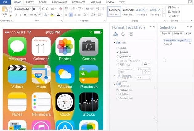
Was the main screen in iOS 7 made in Microsoft Word? [VIDEO]

Because many have wondered how those from Apple got to the current layout in iOS 7, someone made a compelling analogy with Microsoft Word.
Early last summer, Tim Cook announces proudly at the WWDC 2013 the new iOS 7. Although several months have passed since most of us have been able to install the new OS, interface changes have remained largely the same as initially announced. Although changes in the first stage didn’t won too many followers, over time, many of them were given the furrow and began to find the benefits of the new firmware.
In everyone’s mind is left but a question. What was the process by which aggressive colors were choosen, design elements like from the cartoons and, not least, ubiquitous gradients.
Although the video below it works more like a parody that reveals a coincidence, Vaclav Krejci, its author, made an exciting discovery. Hoping that the people at Apple have struggled more than that to the main screen on an iDevice with iOS 7, closely watch the short film below and be amazed at the similarities that emerge in a few minutes. It provides the answer for all the icons, colors and fonts in the new iOS.


 iOS 7
iOS 7 