Buzz Contacts for iphone Review
App Type: iPhone
Improving on Apple’s interface is a minefield of difficulties that most developers dare not tread. Not only are Apple’s apps better integrated into the OS than a third party developer could even hope for, but they are also set as defaults for when other apps send the user to do those tasks. There are still many developers that are trying to make a dent in this area of app development. App Savvy is one such company that has made a slash previously with their calendar app Agenda. With the success of that app they moved to bring their interface design to and status taps to another area of the iOS core software, Contacts.
Buzz takes the element you likely use the most in the phone.app and makes it the center focus of Buzz. Favorites are contacts that you likely interact with multiple times in a day. This could be family, friends, or coworkers but as you list grows the iOS’s build in app only offers you a single list of favorites that can quickly become unruly. Buzz fixes with by allowing you to make groups of favorites and laying them out in a grid pattern that can be swiped through. These groups can be organized by use (work or home) or whatever schema works best for you.
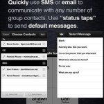
Typical of App Savvy apps, Buzz contacts is more than just a skin. Buzz gives you an almost completely “tapable” interface where every element can lead to feature or function. This fully extends the use of the favorites to include multiple ways to contact people such as alternate numbers, text, or email. You can select the default method, but the others are just a double-tap away. Group messaging, once a cumbersome task, can not be make so simple from a drawer that pulls up from the bottom. A few simple taps and the contacts you want to add are send to a message or email. Organizing an event? Add the participants to a group and now you have easy access to call and message them.
Buzz Contacts, in some ways, does for your Phone app what Agenda did for your Calendar app. For those that haven’t seen Agenda, it is a interface replacement for the iOS built in Calendar. It add many powerful features like integration with Due, and advanced sharing of events, while continuing to use the Apple backend. This works well since there isn’t much integration with the calendar app within iOS. I have been happily using it without even a peep from the build in app. Buzz contacts is equally beautiful and the large speed dial buttons make it so much easier to sort a larger number of favorites in both voice and text.
The Problem™ is twofold. First,, the iOS has many more hooks into their Phone.app so you will find yourself living a bit of a dual life where the iOS will require you to use their app for calling and will more you there for adding shared contacts. Secondly, Buzz excels at managing favorites, the commonly called contacts, but is inadequate as a general contact manager (not to say that Apple’s phone app would win any awards in this regard). I think this is unfortunate for App Savvy but is also one of the realities of the iOS playground. Their focus on this one aspect says to me that they realized their limitations and decided not to make Buzz more than it could be. With this in mind, I do keep my phone app on the front page (abet in a folder) while Buzz has take it’s place as a “single tap app”. If you find yourself wanting more from the iOS favorites, or you have difficult managing the various groups of people you contacts regularly, Buzz Contacts is here you ease your frustrations and give you the freedom to contact as you like.
We rate this app 4 out of 5 stars.
Screenshots
- logo
- screenshot
- screenshot
- screenshot
- logo


 Productivity


