Clear for iPhone Review
App Type: iPhone

Our rating: 


By: RealMac Software
Version #: 1.0.1
Date Released:
Developer:
Price: 1.99
User Rating:If I told you that there was a new exciting To-Do app for the iPhone, you would probably laugh at me. To-Do apps are almost as plentiful as fart apps and there seems to be iterations for just bout every possible scenario. Not to mention that Apple themselves have a built in To-Do app that ships on all iOS 5 devices. While I would agree that this particular niche is quite saturated, there has been an enormous amount of buzz surrounding a particular to-do app that was recently released, so we at Smokinapps feel it is our duty as responsible reviewers to take a look and tell you if Clear from RealMac Software is real the game changer app that fans say it is.
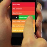
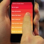
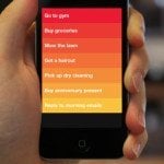
There is no need to discuss how the app works because everyone with a pulse knows how a to-do is supposed to function. The meat of this review will center around the interface that users will make and complete lists with. If you are a fan of uniformity with Apple’s widget design in 3-rd party apps, then I will say this app will drive your nuts. On the bright side, if you like gestures and minimal window dressing in your app, then step right up. Clear has a full screen interface without tabs or status bars. Everything from the tutorial to the settings are done from within the list interface which help enforce the gestures you use within Clear.
The apps starts off with a nice sample list that doubles as a tutorial walking you through the gestures like pinching to move out one level, or spreading two items apart to place a new item between them. The entire interface is cued with musical effects that have such a pleasant sound, that if you always leave your phone on silent, you will be turning on your ringer just so you complete tasks. The colors are heat mapped so that brighter is higher on the list and represent more urgent tasks. If the color scheme is too bright for your tastes, there are several other themes that are available and plenty of unlockable themes that your can discover like easter eggs.
The app design has such a razor focus on being usable and committing to the gesture interface. I love that the entire app utilizes the interface which makes getting use to the left swipe and right swipe easy. This app isn’t your all encompassing project management app, so for that you will have to look elsewhere. Clear is perfect for quick lists and make plans for the day without having to wade through setup. I think the interface, while a deviation from Apple’s core style, gives Clear a concise brand that focuses your mind on the tasks at hand; which if your can’t find an to-do app convenient to use, you wont use it. In that respect, Clear is so lovable, I have been finding ways to get to use its interface more. Bravo to RealMac Software for finding room for innovation in such a well developed field.
We rate this app 5 out of 5 stars.
Screenshots
- logo
- screenshot
- screenshot
- screenshot
- logo


 Productivity


