Reeder for iPad – Review – A most gorgeous Google Reader client
App Type: Uncategorized
Our rating: 


By: Silvio Rizzi
Version #: 1.5.4
Date Released: 2011-11-08
Developer: Silvio Rizzi
Price: 4.99
User Rating:One of my favorite apps on my iPhone is Reeder. Not only is it, bar none, the best Google Reader client in the mobile platform it occupies, it is also one of the most brilliantly designed apps I’ve ever set my eyes upon. But Reeder is not a universal app, that is, the Reeder I purchased for my iPhone (at $2.99) is not optimized to work properly with my iPad, unless I’m fine with viewing an iPhone-sized version of the app on the much bigger screen of the iPad. However, there exists a separate iPad version. Reeder for iPad is available at a reasonably higher price than its iPhone sibling, but at $4.99 it’s definitely a great buy.
As expected, Reeder for iPad adopts the great theme of Reeder for iPhone, characterized by muted tones and textures, and it also inherits the original version’s icon-based navigation scheme. But Silvio Rizzi, the developer of Reeder, is wise to take advantage of the larger real estate of the iPad and run away with the possibilities for a more attractive user experience.
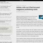
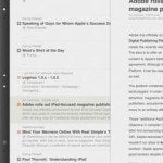
Whereas most other Google Reader clients sport the standard two-pane landscape layout set by Apple itself in some of the iPad’s preinstalled apps, most notably the Mail app, Reeder is not about to rest on its laurels and wear the same uninspired outfit as everyone else does. True, the app also uses the same layout in its presentation, but only at the level where a list of feed items and the main feed content itself are already called for. Most times, what’s on the screen is a grid of folders designed to look like decks of cards.
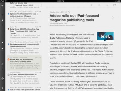 Along the left side of the app is a narrow vertical strip containing several icons. Users of the app’s iPhone version are no doubt already familiar with these icons and what they’re for. The circular arrow at the bottom is naturally the sync button. The trio of icons near the top serve as buttons to navigate Google Reader’s three main feed groups: the star is for the Starred items, the dot for the Unread, and the triple lines for All. First-time users of Reeder may need some time to fully absorb this scheme.
As already mentioned, the folders in any of the three feed groups assume the likeness of a deck of cards, except that they’re labeled with their folder names and numbered with the number of items they contain relative to the nature of the feed group currently in view. This gives rise to a novelty that I so far have never gotten tired of: when you pinch a folder outward, the card representing the folder moves away and reveals more cards representing the feeds in the folder, which are then arranged into a new grid. Conversely, pinching inward returns the feeds into the folder. Tap or pinch-zoom a “feed card” to view its contents in the aforementioned standard two-pane layout, and pinch back to close the card. It’s a vastly amusing trick, apparently inspired by the iPad’s stock Photos app, and it makes an otherwise ordinary task far more exciting and aesthetically pleasing.
Like its predecessor, Reeder for iPad is an RSS feed reader dedicated to a sole Google Reader account, but it also supports various social media accounts for sharing and saving items, including e-mail, Twitter, Facebook, Delicious, and Instapaper. An excellent image viewer is also provided: pinch any image in a feed post and it will be zoomed in, then tap on the zoomed image to bring up the image’s hover text, if any, and the hidden menu to save the image to the iPad’s photo library or to close the full-screen view. Of course, Reeder for iPad is equipped with a built-in Web browser, too. There are, furthermore, the toggle abilities (swipe to the right to mark an item as read/unread, swipe to the left to star/unstar an item) applicable to any post in a list, gesture-based functions that, as far as I know, are unique to the Reeder dynamic duo.
Quick Take
Value:Very high.
Would I Buy Again:Absolutely.
Learning Curve:Medium.
Who Is It For:Google Reader users looking for an exciting way to browse their feed subscriptions.
What I Like:The color scheme. The economical use of icons. The nifty deck-of-cards trick.
What I Don't Like:Nothing, really.
Final Statement:Reeder for iPad, like its original version for the iPhone, makes browsing Google Reader feed subscriptions something to always look forward to.
- Syncs with Google Reader
- Browse by feed or folders
- Manage starred items, notes
- Mark as unread
- Image caching
- State saving
- Slider control for list entries:
> slide to right to toggle read/unread
< slide to left to toggle starred/unstarred
Services/sharing:
- Send to Instapaper, ReadItLater or Readability
- Save to Delicious* or Pinbard
- Save to Zootool
- Post to Twitter
- Post to Facebook
- In-app email for sharing articles
- Instapaper and Google Mobilizer
- Open with Safari
- Copy Link
Please note:
A (free) Google Reader account is required to use this app.
(see https://google.com/reader)


 google reader


