99 Cent iPhone Apps Not Significantly More Popular
 Update: December 12 – see the bottom of the article for a different, possibly more accurate graph..
Are 99¢ apps harming the iPhone app ecosystem?: The Pragmatic Argument
Two days ago Craig Hockenberry wrote an open letter to Steve Jobs complaining about the prevalence of 99 cent apps on the App Store and the “rush” to that price point. He suggests the rush to the bottom is damaging the chances of more significant apps being developed for the platform. We’ve covered the “gold rush” on the iPhone App Store before, and dissected the App Store data to discover that the cheapest apps aren’t the ones making the most money (sounds obvious, but many of the complaints assume it isn’t so).
99 cent (or free!) apps do no more harm to pricier iPhone apps than open source or shareware apps do to commercial PC or Mac software. But the point still stands.. are 99 cent apps really that popular on the App Store? In terms of quantity, there are a lot, but are they significantly more popular than more expensive apps?
Popularity vs Price Band: The Data Argument
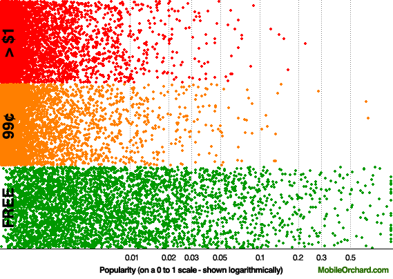
We ran the data from the iPhone App Store through the Mobile Orchard supercomputer and produced the graph above. It shows every iPhone app (free or otherwise) plotted in one of three bands (free, 99¢ apps, and more expensive apps). The y-axis within each band is random and just gives the data more room to breathe. The x-axis is an app’s “popularity” in terms of downloads – shown logarithmically (the App Store provides popularity information within a range of 0 to 1 and > 90% of the apps have a popularity of under 0.01, so we’ve plotted the data logarithmically otherwise you wouldn’t be able to see anything).
If you look at the different popularity bands, you’ll see the 99 cent iPhone apps occasionally have a very slender edge. For example, there are two 99 cent apps in the 0.5-1.0 band – with none from the higher price band. Look at the 0.03-0.05 band, however, and just 32 99¢ apps are represented against 25 from the higher band. This isn’t a whitewash for the 99¢ apps by any means. Visually, you can see that even though 99 cent apps appear to have the edge at higher levels of popularity, it’s just not significant and if you were to multiply the price by the sales obtained at each level of popularity, the higher priced apps would beat the 99 cent apps in overall revenue (we looked at this before in the Games category).
Variations between categories
Above, we looked at the iPhone App Store in general, but the difference between the popularity of 99 cent apps versus higher-cost apps becomes more pronounced if you hone in by application category.
Let’s run the data for several categories through the Mobile Orchard supercomputer:
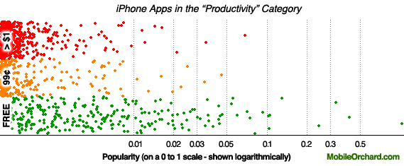
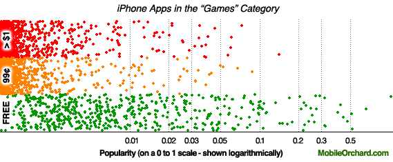
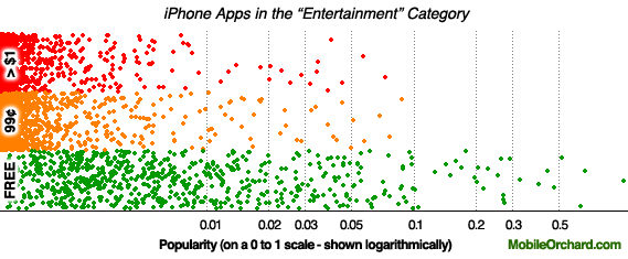
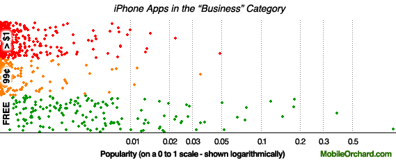
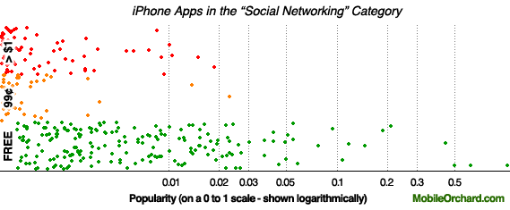
In the Business and Productivity categories a clear preference for higher priced apps is shown. In the Games category it’s less obvious, but visually the 99 cent band is no stronger than the higher priced band. The Entertainment graph, however, shows that 99 cent apps are certainly a lot more popular there than the higher priced apps.
The Social Networking category shows a strong preference to higher priced apps. This category seems to have quite a few solidly-priced instant messenger apps and in comparison to the 99 cent apps, they’re doing very well. As always, however, the free apps completely trounce the pay-for apps.
Where next?
Seeing the differences between application popularity and price visually is very appealing, but we’re now working on processing this data numerically to produce “willingness to buy” scores for each of the application store categories. Which categories have people spending the most and what sorts of applications are people most likely to pay for? This information will undoubtedly be of use to you if you’re an iPhone developer or speculating on what to develop for the platform.
Update
Graph with all price points (> $50 mixed into top line) – click on the graph to get full size
There’s no analysis on this just now, but to help address those who want to see how it looks if price is more accurately traced on the Y-axis, we have this very quickly produced graph (same process as the others but with the y-axis accurately portrayed and no scale shown).
It is worth noting, however, that the main part of this article address whether 99 cent applications are more popular than all other higher priced applications – which is why the bands are defined as they are.





Can’t say I think much of Craig Hockenberry’s letter.
Then you’ve made your bed and you should happily lie in it. Other people are working on cool/complex things and they are going to eat your lunch.
This is like game theory. Everyone gets to set their own price point and develop whatever they want. You seem to think you have an approach that works for you. So what are you complaining about? Seriously, I have no freaking idea what you think Apple should be doing differently.
Love your graphs, Peter! Very interesting. I didn’t know sales figures were completely public knowledge?
M.
They aren’t, but the “popularity” figures Apple provides (which are of significant resolution) correlate with the overall sales rankings very well, so we’re confident there’s a connection though it’s definitely not to the level of determining how many copies were sold but just how apps relate to each other.
Very interesting graphs, thanks for posting.
One has to wonder though, if the 99 cent apps were all $4.99 instead, would they have the same popularity? It looks like it would based on the graphs, but keep in mind you’re showing two separate groups of apps.
When I think of 99 cent apps, I think of small developers hoping to make a buck. These don’t have the budget for outside advertising, or the name/branding to afford a higher price point. So the fact that they are just as popular as the higher price apps (which more often have extra advertising and branding) may be a win for the 99 cent apps.
But I’m purely speculating.
Great graphs! Would be interesting to see a breakdown that separated higher priced apps into more categories ($3 or below, $5 or below, etc) to get even more insight into higher price point sweet spots.
We’ll be launching our next iphone game soon at a price well above 99 cents…
Ah, yes, should have caught that. Popularity is probably sales per unit time or the rate of change of the sales per unit time. Would be interesting to see how that compares with actual revenues.
I’ve produced a graph that shows the same data but with the y-axis more gradually representing the price points. We plan to use it in another post 🙂
nice plots, but there is an awful lot of experience with plotting such data, and the consensus is you should use boxplots (or the more fance violinplots) to represenst such data. Any claim about differences should be tested with a t-test. Otherwise this is just visual interpretation, and human eyes should be distrusted.
It might be interested to use the relation between the popularity of the free version and the paid version to get an idea how good an app is. I’d have to think a bit more about the concrete measure here, but the idea is that when a large portion of the people that tried the free version actually bought the paid version, then you’ll have a good app. If the free version is tried a lot, but only very few people actually buy it, then it is probably rubbish. Let me know if you are interested in any concrete implementation of this idea.
best
michael
Not to be ornery, but where are apps that cost exactly $1? Are they in the “99 cent” category or is the “greater than one dollar” category really supposed to say “greater than or equal to one dollar”? Or are there no apps that cost exactly $1 in the app store?
I’ve got to challenge your assumptions here, and therefore your conclusions. (Mr. Bates and Quasar begin to address my point.)
This is not a controlled experiment where we can compare how much/whether the same app is more popular at one price point vs. another. You are not comparing apples to apples, and so you need to account for that.
Luckily, there is a very easy way to do this: regression analysis. You can have any statistical package — or even Excel — look to see if there is a relationship between price and popularity. Regression allows your to control for outside factors, to make it a slightly more apples to apples comparison. For example, you add background variables for category, for rating, for time since released. And you see see how many of these are associated with greater popularity.
Unfortunately, even regressional analysis doesn’t really address the flaw here. Hockenberry was talking about the apps that won’t get written. His point was that you won’t see them in first place because the store hasn’t show that a more expensive and more featured app can make enough money to support its development. This analysis would need too look much closer that the big categories to examine that idea.
For example, look at twitter clients. How well did an expensive one sell once cheaper ones became available? Is there is lesser featured and cheap twitter client that might or might not sell better than Twitterific? Where are the real comparisons on a substantive level?
In other words, the fact that you have a lot of data is not enough. In fact, the volume of data is too great, and you have too look on a more granular level.
His point was that you won’t see them in first place because the store hasn’t show that a more expensive and more featured app can make enough money to support its development.
Super Monkey Ball? Crash Bandicoot?
In other words, the fact that you have a lot of data is not enough. In fact, the volume of data is too great, and you have too look on a more granular level.
That would be a reasonable thing to do once we have more data over a longer period of time. For now, however, we just need to get these conversations started, however crudely.
Peter,
I think it would be instructive to add a couple of more price categories.
Now you have Free, $1
I suggest adding $1-$4.99 $5.00-$9.99, and $10.00 and up.
It seems to me the interesting data would around the $4.99 price.
Great graphics!
This reminds me of (and I’m sure you are familiar with) the Minard’s graphic of Napoleon’s March to and from Moscow.
https://www.edwardtufte.com/tufte/posters
Your graphics are also compelling. Create more.
I didn’t crunch all the math, but 32 apps is 28% more than 25 apps in the 0.03-0.05 band, which seems like a *statistically* significant difference. In which case, your conclusion about $0.99 apps not being more popular would be faulty (at least for overall sales).
I have broken all the data down from all available sourcing FOR MY PERSONAL USE! (I have broken this stuff down in so many ways it is like looking at the Forbes 400 list), but I am curious to see it discussed publicly. Isn’t pulling available data off proprietary software illegal? Even when said software is from a public company? Apple still own this data, and it is being pulled from proprietary software. Maybe I am completely wrong on that though?
Well despite the questioning of other variables, Peter does make the basic general point that 99 cent apps. on the surface are close to equal in sales to above $99 cent apps.
The main issue I see is when you add the variables, If someone views this article and comes away with thinking a $4.50 price point for their App might be wiser than their originally perceived plan to charge 99 cents based on the overall premise of these graphs, it could be a big mistake.
Perhaps 95% of the above 99 Cent apps that are sold are at $1.99. The graph would look much different if the breakdowns are free apps vs. 1.99 and below apps, and above 1.99$ apps…hypothetically
Where in the app store do you find these popularity ratings?